-
Type:
Task
-
Resolution: Released
-
Priority:
Should have
-
None
-
5
-
Donate page
-
Sprint #136
-
saturn
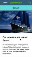
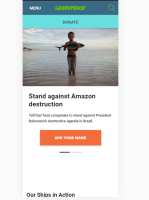
As a follow-up of this ticket Planet-4128, make UX recommendations on the mobile Donate button based on the A/B test results.
Results from the AB Test:
Summary: After 20 days, the A/B test was successful and we have a clear winner: The Enhanced Donate Button on Mobile.
This version has 99% of probability of being the best. There's a 95% chance that the alternative design can drive an uplift from 6% to 108% on the button's click-through rate.
This covers the test's goal of being able to identify the improvement of at least 15-20% on the CTR.
Tasks
- Implement enhanced mobile button design in all sites (use CSS of
PLANET-4127- adjust if needed) - In "Planet 4 settings" add a new checkbox field just below Donate button text field called "Donate button visible on mobile"
- Below field add small text in Italics "Enable visibility of the donate button on the homepage. The button will still appear in the main navigation menu as well. Read more" And add a link to the handbook page with guidelines
- blocks
-
PLANET-3290 Explore "Donate" Button enhanced visibility on mobile
-
- CLOSED
-
- has to be done after
-
PLANET-4128 Implement A/B Test on Donate Mobile Button (GPNZ + Others)
-
- CLOSED
-
- is triggered by
-
PLANET-4085 Enhanced "Donate" Button visibility on mobile
-
- CLOSED
-
- relates to
-
PLANET-6522 Remove option for enhanced Donate button
-
- CLOSED
-
-
PLANET-4991 UX recommendations for the mobile Donate button based on A/B test results
-
- CLOSED
-


