-
Type:
UI task
-
Resolution: Unresolved
-
Priority:
Should have
-
None
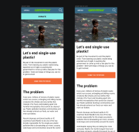
As a user I would like to see the Donate button more clearly on Mobile and Tablet Portrait. Based on the UX work carried out by cchan wmorrisj will do the UI work. The original UX work can be found here - https://jira.greenpeace.org/browse/PLANET-3544
Requirements needed:
- Created Data ticket
PLANET-4099from Julia to provide Donate click ratio in homepage of different NROs - Define in which pages should the button be shown
- is cloned by
-
PLANET-4140 Provide rules for Donate button behaviour on mobile
-
- CLOSED
-
- is triggered by
-
PLANET-3544 Explore "Donate" Button enhanced visibility on mobile
-
- CLOSED
-
- is triggering
-
PLANET-4127 Create CSS for enhanced DONATE mobile button test
-
- CLOSED
-
-
PLANET-5081 Add option for enhanced mobile Donate button in settings
-
- CLOSED
-
-
PLANET-4128 Implement A/B Test on Donate Mobile Button (GPNZ + Others)
-
- CLOSED
-
- relates to
-
PLANET-4099 Investigate click rate of donate button on homepage
-
- CLOSED
-
-
PLANET-4991 UX recommendations for the mobile Donate button based on A/B test results
-
- CLOSED
-

