Improve the Grid layout style for the Take Action covers block based on UX recommendations
Tasks:
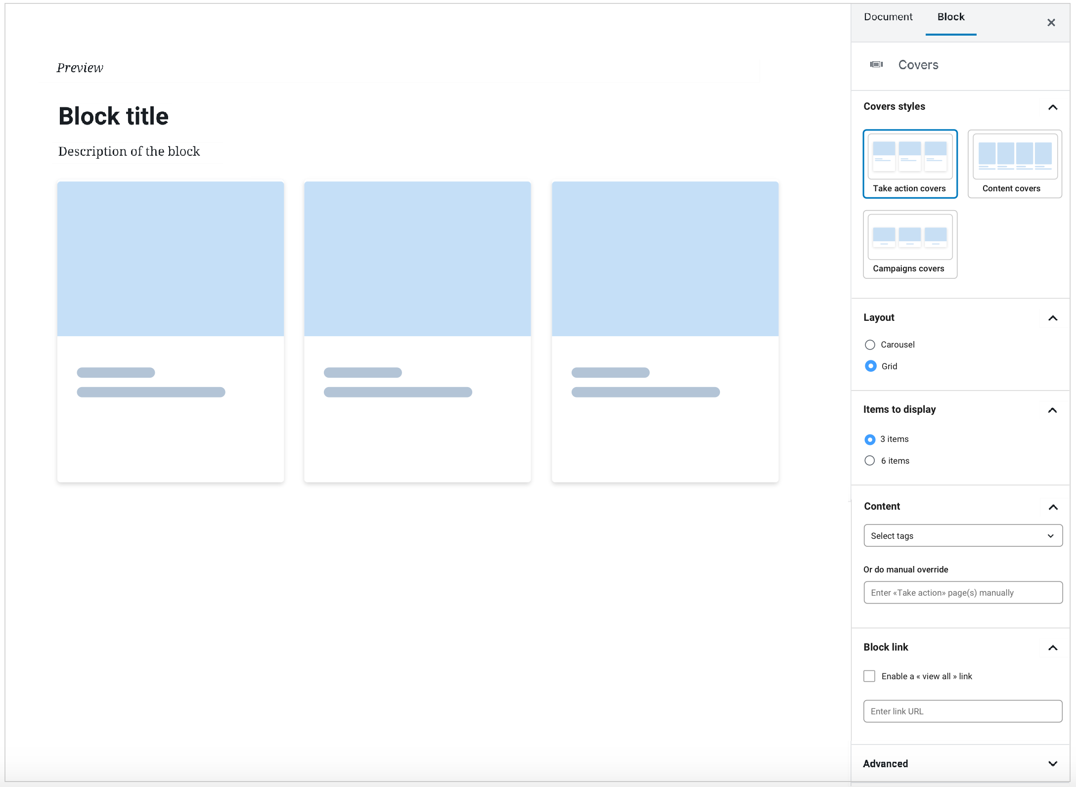
- Follow the wireframes recommendations (see screenshot).
- Rename « select posts » by « select take action pages .
- Rename "rows to display" by "items to display".
- Replace the «select tags» field by a dropdown menu where we can choose from available tags.
- 3 items (covers) should be selected by default in the "items to display" section.
- The « Load more » button behavior should remain the same. If 3 covers are displayed, the « load more » button should load 3 more covers. If 6 covers displayed, the « load more » button should load 6 more covers.
- We could display a placeholder image instead of an error message when the content block is empty, so that users could quickly visualize how the block looks like even without content.
- Add a section to enable a "view all link".
- Description of the block: Add a characters limit to 120 characters.
- is blocked by
-
PLANET-5523 Convert Covers block to WYSIWYG (Beta)
-

- CLOSED
-