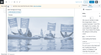
The help texts in the editor sidebar currently follow the typography rules introduced with https://jira.greenpeace.org/browse/PLANET-5080 However that makes them look disproportionately big compared to the rest of the sidebar, especially on larger screens (see screenshots)
Tasks:
Make recommendations for font size, line height, and any other text-related specs to improve the UI of the help text.- stick with Wordpress admin UI defaults, both for continuity of the backend experience and to give us less to maintain. In this case, it looks like some of our CSS is overriding the Wordpress defaults.
- Some of the CSS designed to help make the WYSIWYG preview look more like the final page is being applied to the Wordpress admin UI, so if we scope the CSS in _typography.scss:22 and :24 to apply just to the editor content area, that should to it.
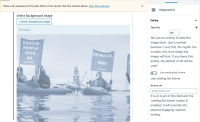
- adding ".block-editor-editor-skeleton__content" to the beginning of those selectors seems to do the trick (Screenshot: see attached)

