-
Type:
UX task
-
Resolution: Fixed
-
Priority:
Should have
-
None
-
Block: Covers
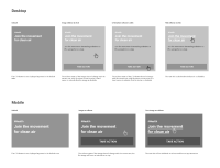
As a follow up from PLANET-4066, please review UX based on Julia's heatmap analysis below.
Julia's recommendation:
The heatmaps added to this ticket are showing a considerable amount of clicks on the Take Action Cards background and title, on both desktop and mobile. Therefore, it's recommended to make the whole card clickable. You can also check the heatmaps highlights here.
- causes
-
PLANET-2558 Decide if we should modify floating take action card design
-
- CLOSED
-
- has to be done after
-
PLANET-4066 Take Action cards: run Heatmap analysis on Take Action Covers
-
- CLOSED
-
- has to be done before
-
PLANET-5072 Implement A/B Test on the Take Action boxout (posts)
-
- CLOSED
-
- relates to
-
PLANET-5060 Simplify passive state of Take Action cards on desktop and mobile
-
- CLOSED
-
-
PLANET-4945 Redesign the default CTA button on Take Action cards on mobile
-
- CLOSED
-


