From UX recommendations:
Problems:
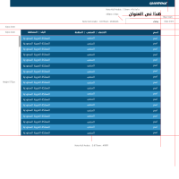
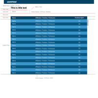
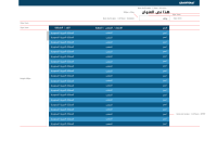
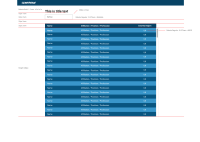
- When users scroll down the spreadsheet, they lose the context of the columns labels.
- There is no clear visual indicator to sort the spreadsheet.
Recommendations:
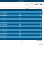
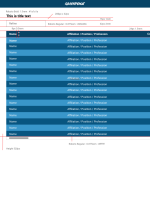
- The spreadsheet should have a sticky header so that users don't lose context when they scroll down.
- We should display the sorting arrows by default on mobile, and on roll hover on desktop. We should then remove the « default sorting » button.
Tasks
- These 2 have been done:
Make the header row to be fixed when scrolling vertically through table(Done)Remove the « default sorting » button(Done)
- To be done: Display sorting arrows next to header text by default on mobile, and on roll hover on desktop
- Check font-awesome for arrow icons and confirm with design team. Include the svg files in our icons sprite.
- clones
-
PLANET-4913 Spreadsheet block: Fix size and add scrolling
-
- CLOSED
-
- is cloned by
-
PLANET-4915 Spreadsheet block: improve search behaviour within block
-
- CLOSED
-
- is triggered by
-
PLANET-4791 Spreadsheet & Table blocks UI
-
- CLOSED
-
