-
Type:
Task
-
Resolution: Released
-
Priority:
Should have
-
None
-
2
-
Block: Spreadsheet
-
Sprint #129, Sprint #130, Sprint #131
-
deimos
From UX recommendations:
Problems:
- When there is a lot of data in the spreadsheet, users have to scroll down the page for a long time before reaching another section of the page.
- The spreadsheet width doesn't follow the grid width on some screens. On desktop screens, the spreadsheet width is too narrow. On mobile (portrait view), it takes the full width of the screen.
Recommendations:
- We should then fix the block height to avoid first issue above. If the data is longer than the fixed height, then users can scroll down within the spreadsheet.
- For every screen, the spreadsheet should follow the grid width. We should add margins on the left & right-hand side, on mobile screens.
Tasks
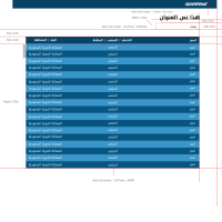
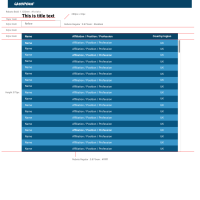
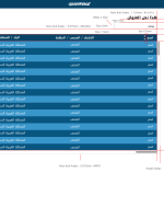
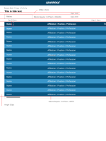
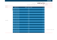
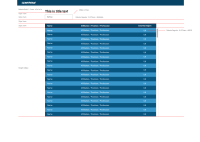
- Set height as shown in attached designs
- Set full width
- Implement horizontal scrolling within table
- is blocked by
-
PLANET-4870 Spreadsheet block: Remove Case sensitivity from search
-
- CLOSED
-
- is cloned by
-
PLANET-4914 Spreadsheet block: Sticky header and sorting UX
-
- CLOSED
-
- is duplicated by
-
PLANET-4790 Define mobile behaviour for spreadsheet block
-
- CLOSED
-
- is triggered by
-
PLANET-4791 Spreadsheet & Table blocks UI
-
- CLOSED
-
- relates to
-
PLANET-4789 Refine Spreadsheet and Table block colours
-
- CLOSED
-
-
PLANET-4689 Define mobile behaviour for spreadsheet block
-
- CLOSED
-
(1 relates to)
