-
Type:
UI task
-
Resolution: Duplicate
-
Priority:
Should have
-
None
-
Block: EN Form
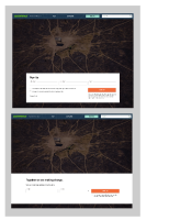
the "Text Below CtA" works very well for the "Form on the Side" style, but for the 2 other styles it does not render well (see snapshots).
We need to define how it should look like for the 2 other styles:
- Page body-text size width
- Full page width / background image
See example here >> https://k8s.p4.greenpeace.org/en-test/512-2/
- duplicates
-
PLANET-3855 EN Form: Re-style full width style (incl. text below CtA)
-
- CLOSED
-
-
PLANET-3771 EN Form: Design for text below CtA for "Full page width / background" style
-
- CLOSED
-


