-
Type:
UI task
-
Resolution: Done
-
Priority:
Should have
-
None
-
Block: EN Form
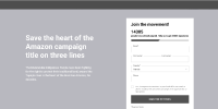
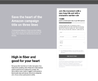
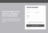
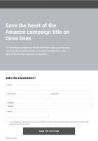
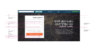
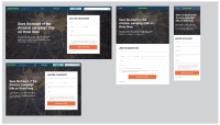
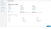
Let's discuss how we could add a left/right side layout option to the EN form block. All our petition pages have the signup form on the right side (or left, based on the language).
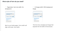
I see three layout options:
- static: the block would be part of the layout, practically resizing any other block that is next to it. scrolling on the page would move the form so potentially it would leave the viewport - not the best solution. example: https://secure.greenpeace.org.uk/page/s/no-new-oil
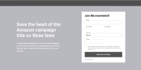
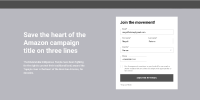
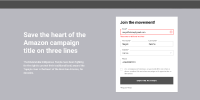
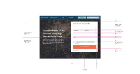
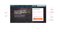
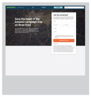
- absolute positioning: the form block has a fixed position, not part of the layout, scrolling is not changing its position. better for conversions but potentially makes the content difficult to consume. this option is only working on desktop size screens, on small screens we'd need to fall back to static positioning. example: https://heartoftheamazon.org/
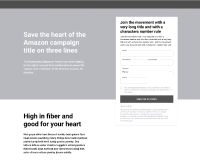
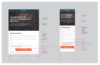
- collapsible: the block is part of the layout, but when you scroll down it collapses to not cover the content but still stays in the viewport. this is the best solution, would it be very complicated to implement? also works nice on small screens, where it collapses to the bottom (could also collapse to the top) example: https://www.peoplevsoil.org/en/
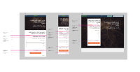
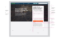
Question: how should we proceed with the design? Should we ask for a wireframe from our designers or could we just do a prototype?
- blocks
-
PLANET-3482 EN Form block: Add options for two new styles in backend
-
- CLOSED
-
-
PLANET-3483 EN Form Block: Add new side style in the front end
-
- CLOSED
-
