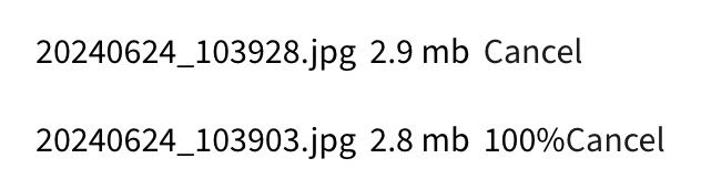
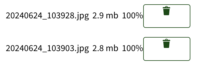
Small style fixes for the Gravity Forms multiple file upload
- Assignee:
-
Maud Leray
- Reporter:
-
-
Pedro Figueroa
- Votes:
-
0 Vote for this issue - Watchers:
-
0 Start watching this issue
- Created:
- Updated:
- Resolved:
This issue has been migrated to a new Jira instance:
PLANET-7568