-
Type:
Task
-
Resolution: Unresolved
-
Priority:
Should have
-
None
-
8
-
Block Patterns, Styling/Theme
Summary
Align the spacings of the High-level topic layout with the Design system mockups.
Requirements
- Desktop XXL, XL, & L:
- Make the spacing 80px between:
- "Reality check" & "Media & text" blocks.
- "Media & text" & "Deep-dive topics" blocks.
- "Media & text" and "Highlighted CTA" blocks.
- "Highlighted CTA" & "Covers" blocks.
- "Covers" and "Articles" blocks.
- "Articles" & "Content Covers" blocks.
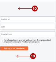
- "Content covers" & "Newsletter" blocks.
- "Newsletter" & "Quick links" blocks.
- Mobile M & S:
- Make the spacing 56px between:
- "Reality check" & "Media & text" blocks.
- "Media & text" & "Deep-dive topics" blocks.
- "Media & text" and "Highlighted CTA" blocks.
- "Highlighted CTA" & "Covers" blocks.
- "Covers" and "Articles" blocks.
- "Articles" & "Content Covers" blocks.
- "Content covers" & "Newsletter" blocks.
- "Newsletter" & "Quick links" blocks.
- Remove the white space between the "Nav bar" & the header.
- Make the padding-top & bottom 56px for the Newsletter block.


