Page header pattern excessive spacing on tablet and mobile devices

XMLWordPrintable

    • Type: Bug
    • Resolution: Merged
    • Priority: Should have
    • 2.112.0
    • None
    • 3
    • Block Patterns
    • pluto

      Example Page

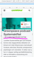
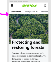
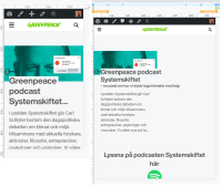
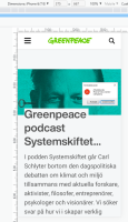
      The page header doesn't look right on tablet and mobile devices. The title gets cut off on mobile and there's some extra space above the image. On tablet view, it shows everything skewed on the left side of the screen.

            Assignee:
            Dan Tovbein
            Reporter:
            Svilena Koleva
            Votes:
            0 Vote for this issue
            Watchers:
            0 Start watching this issue

              Created:
              Updated:
              Resolved: