-
Type:
Task
-
Resolution: Duplicate
-
Priority:
 Could have
-
None
-
Navigation
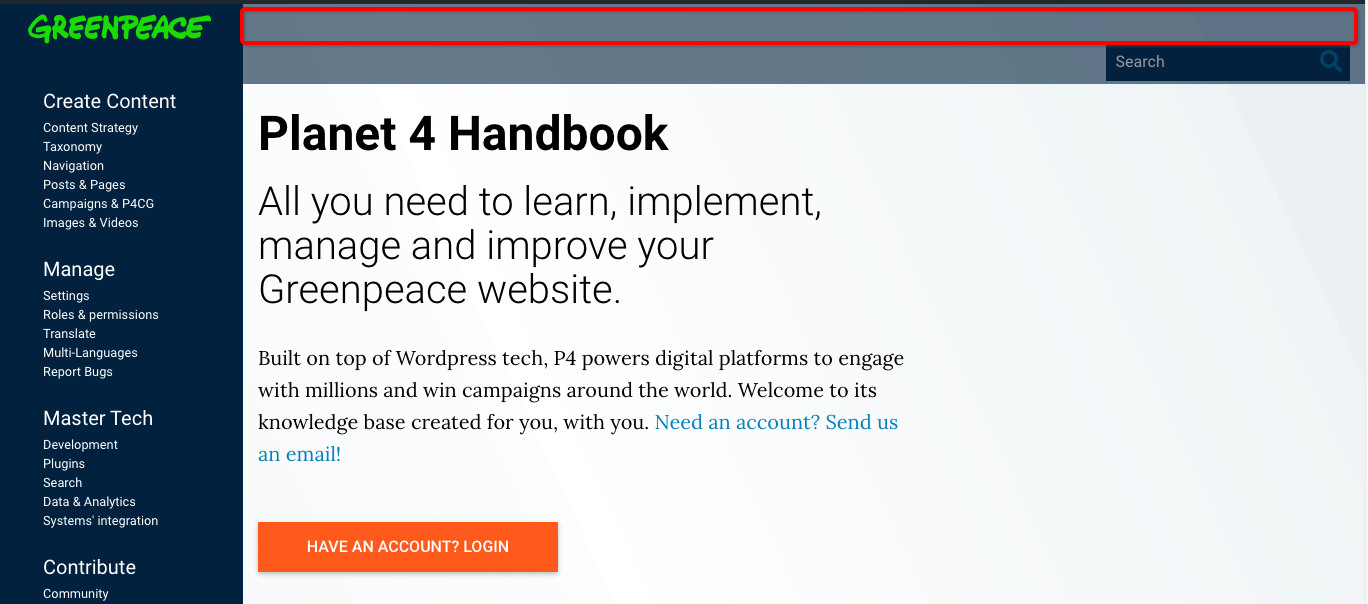
In desktop screens there is unnecessary space between the header and the search bar, whihc is also misaligned,.
We should align the GP logo with the search bar, reducing the overall blue overlay, see scrennshot and eventually align with wmorrisj for design specs
UPDATE:
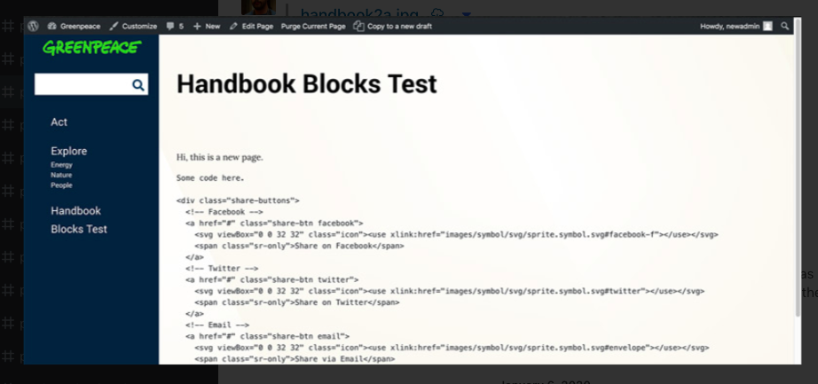
- pcuadrad started already doing some design and proposing alternative placement of search bar in left-side nav (see Snap)
- We should test usability, especially in relation to the already long left-side nav, to facilitate content access and consumption.
- Desktop is priority, but tests should also happen in tablet and mobile screens
cc wmorrisj
- is duplicated by
-
-

- CLOSED
-
- relates to
-
PLANET-4637 Handbook: propose new search bar placement (esp. desktop version)
-
- CLOSED
-