-
Type:
Task
-
Resolution: Won't Do
-
Priority:
Should have
-
None
As suggested by pcuadrad and described in PLANET-4637 we are exploring a more user-friendly Handbook nav.
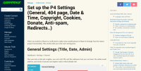
This task is about a UX review of the Submenu block, which is widely used across the Handbook. The Submenu block is quite unpredictable having 2 columns, and the idea is to move it to the right side, made it a bit smaller, single-column, and added a "CONTENTS" title
- relates to
-
PLANET-4849 Handbook: review Pablo's recommendation #3 - Submenu block changes
-
- CLOSED
-
