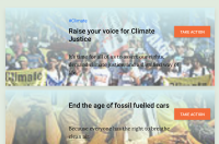
I think we should either:
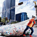
1) use a better resolution version, so it's not pixelated
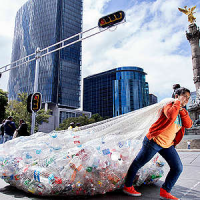
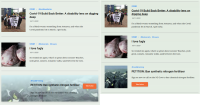
2) make the take action content similar to the other content types, and just use a square thumbnail on the left.
Tasks
- Move image on the left side as a thumb, like the rest of the results
- Get design input for the button placement
mfatome open to your thoughts on this!
https://www.greenpeace.org/international/?s=climate&orderby=_score
