-
Type:
Task
-
Resolution: Merged
-
Priority:
 Must have
-
None
-
2
-
Responsiveness
-
Sprint #150, Sprint #151, Sprint #152, Sprint #153, Sprint #154
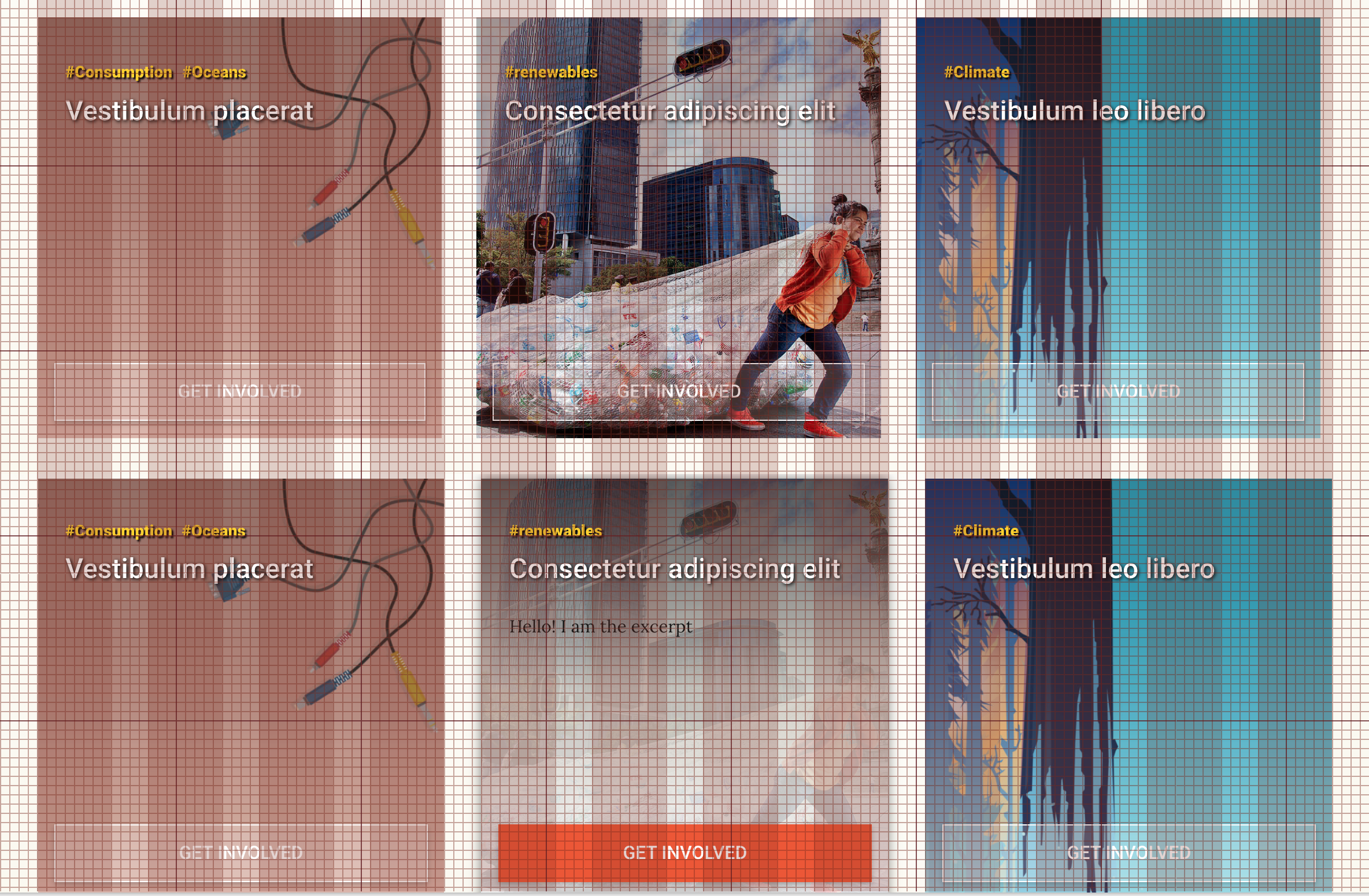
Our current layout does not follow the 8px grid we are supposed to be following. Several steps need to be taken until we have a pixel-perfect grid layout. I made a few Sketch templates with an 8px grid for designers, in order for the site to be in sync with that grid we need to change a few things in the master theme and the blocks.
I started an experimental PR to test the changes. The attached sample file has a screenshot of the current site on top of the Sketch template on the top half, and in the bottom half you can see a screenshot of the site with the new grid adaptations, as you can see, it matches the template perfectly. This will hopefully improve the handoff from design to dev a lot.
In order to reach that point, we need to apply some rules to the whole site:
- Change Bootstrap's grid variables to match the 8px grid (DONE).
- The smallest spacing unit should be 8px, not 4px, so we should remove sizes like 4px and 12px. All units should be divisible by 8: 8, 16, 24, 32, 40, 48, 56, 64, 72, 80...
- The use of the Bootstrap grid is not entirely consistent across the site. We need to make sure we do use the grid classes and restrain to it:
- We should make container the top-level element (right after body).
- We need to remove any paddings or widths to the page-template class and possibly make it a child of container.
- Ideally, there should be only one container per page. Use row for splitting content vertically and col for splitting horizontally. In case we really need a container inside the top container, it should be contained by another row and col.
- Breaking out of the container is possible, achieved currently by the block-wide classes. Make sure we are applying that correctly.
- Make sure the grid elements (divs with container, div, col classes), don't have any other classes/styles on them, instead of doing that, add child divs inside of them, for example:
- <divclass="col-md-6"> --> Good!
- <divclass="col-md-6 my-padding some-border"> --> Bad!
- <divclass="col-md-6">
<divclass="my-padding some-border"> -> Good! Do this instead. - Make sure we are not overriding those classes with CSS (Example: https://github.com/greenpeace/planet4-plugin-gutenberg-blocks/blob/master/assets/src/styles/blocks/Covers/ContentCovers.scss#L8).
- Change any arbitrary paddings or margins in elements to the 8px-based spacing variables.
- These are all the rules I can think of at the moment.
As this is a site-wide change, we need to split it into parts. So I guess we can create a GRID Epic to track progress.
For the blocks plugin, it's easy, we can create tasks and go block by block.
For the Master Theme, I think we can split it into some components:
- Refactor the page-template class, make sure it does not set any width or padding.
- The post page (single.twig)
- The page template (page.twig)
- Password protected post page (single.twig)
- Password protected page template (single-page.twig)
- Campaign template (single-campaign.twig)
- Evergreen (evergreen.twig)
- The Author page (author.twig)
- is FF-depended by
-
-

- CLOSED
-