-
Type:
UI task
-
Resolution: Done
-
Priority:
 Should have
-
None
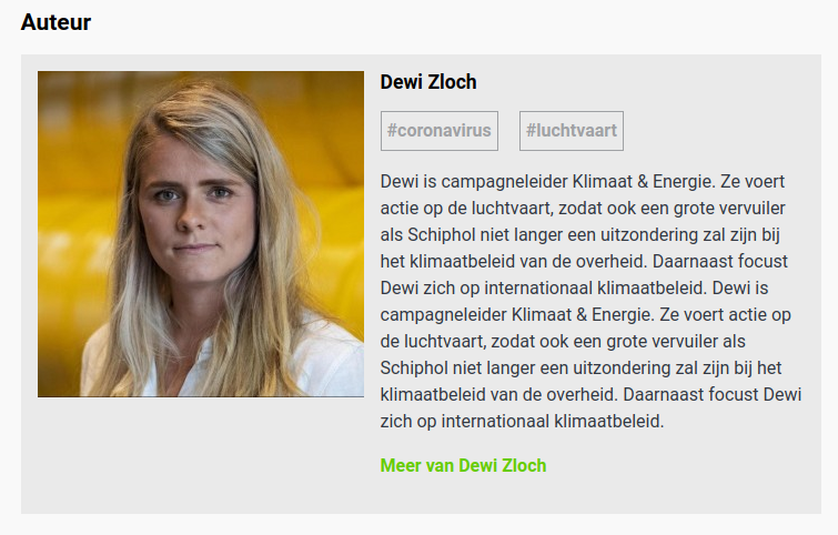
We currently have a custom very fragile way of limiting Author bio text. We do that in order for the bio text to be aligned with the Author bio. There is not a simple an reliable way of limiting lines of text across all browsers, and the Author photo is displayed in different heights between different screen sizes.
One idea would be to evaluate NL's solution and provide a similar design. What they did is wrap the whole block with the gray background color we use only for the text. So even when the text is long, it doesn't feel miss-aligned compared to the photo.
Here is a live example below. Also attaching two screenshots to show how this looks when the text is too long.
https://www.greenpeace.org/nl/klimaatverandering/33072/europese-luchtvaartmaatschappijen-vragen-128-miljard-staatssteun/
Implementing a similar design will let us remove all the max-height complexity while offering a nice UI.

- blocks
-
PLANET-5035 Author bio: text box is longer than the image on M screens
-
- CLOSED
-