-
Type:
Bug
-
Resolution: Fixed
-
Priority:
Should have
-
2
-
Campaigns
-
Sprint #115
I'm checking my usual test sites:
https://release.k8s.p4.greenpeace.org/international/campaign/all-available-blocks/
https://release.k8s.p4.greenpeace.org/international/campaign/all-available-blocks-antarctic/
https://release.k8s.p4.greenpeace.org/international/campaign/all-available-blocks-arctic/
https://release.k8s.p4.greenpeace.org/international/campaign/all-available-blocks-climate-emergency/
etc, and I noticed some newly introduced issues:
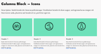
EN Form block - Form on the side style: checkbox missing on all templatesColumns block - Icons style: Call to Action link overlapping Column text (fixed in a previous PR)Footer - CC icon not aligned vertically with Greenpeace International 2019 textColumns block - Tasks style: button text color is not OK, in some templates it's not visible at all, in some other templates it's an unusual color - it should match the CTA button text colors in the other blocks of the page- minor remark: EN Form block CTA button font is Roboto, the other CTA button fonts on the sites are not. I know that Will's guidance is to use Roboto in the EN Form but maybe we should reconsider the button font or make a decision for all button fonts in all blocks


