-
Type:
UI task
-
Resolution: Unresolved
-
Priority:
Should have
-
None
-
Styling/Theme
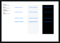
The blue link colour fails accessibility on dark backgrounds. Review and create an alternative link colour that either works on all backgrounds (The ideal) or provide two styles for light and dark.
Having done lots of tests on multiple colours accross backgrounds from #FFFFFF to #1a1a1a to is clear that links are more likely to pass accessability if they are bold. The Four strongest link colours are #66cc00, #32ca89, #2980b9 and #F36D3A. #2980b9 is our current colour.
Tasks
- Change link color to #006DFD
- On rollover add underline and 10% darker (by reducing the Luminance value in the HSL version of the color)
- clones
-
PLANET-4175 P4 - Review Link colours on dark backgrounds
-
- CLOSED
-
- relates to
-
PLANET-5079 Adjust in-line link colour for better accessibility
-
- CLOSED
-
-
PLANET-1724 Improve link accessibility
-
- CLOSED
-
