-
Type:
Bug
-
Resolution: Fixed
-
Priority:
Should have
-
None
-
None
-
Styling/Theme
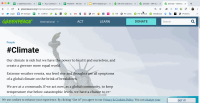
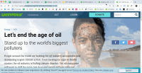
Shedding Light design looks different in both (auto-generated) Tag pages, default template and evergreen (see gifs)
This might be causing other issues reported like:
Most of these issues can be easily visible in Expore pages, or evergreen pages
- Shedding light effect moved
- "Latest Articles" moved a few (10?) pixels to the top
- Same for “Content after the header (first block) moved 10px to the top”
- Footer icons moved by a few pixels
- Evergreen pages are 100% width instead of 65%
- is caused by
-
PLANET-4305 Transformed text is not migrated as corresponding Gutenberg native blocks
-
- CLOSED
-
- relates to
-
PLANET-4318 Split 2 column block: CTA button is smaller in medium screen resolution
-
- CLOSED
-
-
PLANET-4316 No search icon on header bar in smaller screens
-
- CLOSED
-

