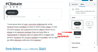
The native Gutenberg "Button" block should be harmonised according to our CSS Styleguide https://planet4.greenpeace.org/styleguide/section-components.html , to avoid over-proliferation of colourful buttons all over p4 sites.
For the Button block please:
- Allow only "Squared" style for now (according to CSS styleguide rules)
- Remove "Colour Settings" for now
- Add 3 new styles according to CSS styleguide:
- Donate
- Call To action - primary
- Call to action - secondary
Please follow the CSS styleguide for styles and colour and if in doubt check with wmorrisj
Please make sure also MENA (left-to-right) is aligned
Tasks
- Hide "Default" and "Outline" styles for button, and leave only the "Squared" option
- Adjust colour palette according to P4 style
- Remove "Color settings" section
- is duplicated by
-
PLANET-4125 Gutenberg: Align "Button" block with CSS Styleguide
-
- CLOSED
-
- relates to
-
PLANET-4154 FILE Block: adjust button style and functionality
-
- CLOSED
-
