-
Type:
Bug
-
Resolution: Fixed
-
Priority:
Should have
-
None
-
2
-
Posts
-
Sprint #103
Description of the issue: When viewing Images in Posts, the spacing around
the image is inconsistent depending on how the image is used on the page.
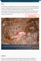
When the Image place is using a block, there is a significant amount (too
much?) of space above & below the shortcake.
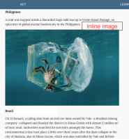
When the Image is placed inline, there is no additional space above or
below.
See the word "Brazil" in this example:
https://release.k8s.p4.greenpeace.org/international/story/23781/
Not sure which is the correct behaviour; the shortcake or the inline..?
(I think inline looks cleaner/tighter) wmorrisj

