-
Type:
UI task
-
Resolution: Fixed
-
Priority:
Should have
-
None
-
Campaigns
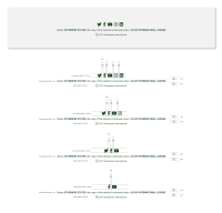
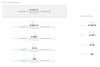
Now we have the option to overwrite the regular social media icons in the footer, but if we have less than five icons then the alignment is not perfect. Could you please provide the design for how it should look like if we have 1-2-3-4 icons only? Also please provide design for both the regular and the minimal footer versions.
Example: https://release.k8s.p4.greenpeace.org/international/campaign/footer-test-campaign/
- is cloned by
-
PLANET-4139 Alignment of social media icons in all footers
-
- CLOSED
-

