-
Type:
Task
-
Resolution: Fixed
-
Priority:
Should have
-
None
-
2
-
Block: EN Form
-
Sprint #91
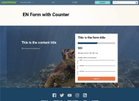
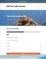
Text is unreadable on the image background of the EN form, so please add solution applied to Carousel header in PLANET- (I'll look for it) but if you know which is it don't wait for me.
Magali's comment in linked design task:
Magali Fatome pointed out that she has done the work on this for the new carousel and we don't need to do this piece of work. Here is the structure. Image -> then CSS background -> then blurry PNG -> then text. Here is the css for the background background: rgba(30,30,30,.45);
- relates to
-
PLANET-3612 Adjust EN form background to allow text to be more readable
-
- CLOSED
-

