Planet 4 Bug Report
===================
Requestor's email: ktolen@greenpeace.org
Requestor's Skype:
Page: https://www.greenpeace.org/international/act/jobs/
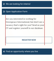
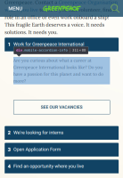
Description of the issue: On a mobile device the button should have more
padding on the right side so it is inline with the description text. The
padding on the description text is also off; it should be balanced with the
left margin.
Attachments:
https://drive.google.com/open?id=1u1yl6yP1Sz4H6omucXZe6RbWvAwqlDWX

