-
Type:
UI task
-
Resolution: Done
-
Priority:
Should have
-
None
-
None
-
2
-
Block: Counter
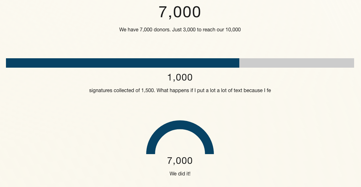
The new counter block uses Helvetica Neue instead of Roboto, I know. But also, this isn't designed.
The numbers and text are customizable. But we should give some guidance on line breaks and size and font and length and things. Without adding features, can you make this pretty?
See the block in action here: https://k8s.p4.greenpeace.org/international/shortcake-blocks/

- is cloned by
-
PLANET-4223 Apply design fixes of Counter Block
-
- CLOSED
-
- is duplicated by
-
PLANET-3191 Design: Counter block design review
-
- CLOSED
-
- is triggering
-
PLANET-3557 Counter Block: Implement design changes
-
- CLOSED
-

