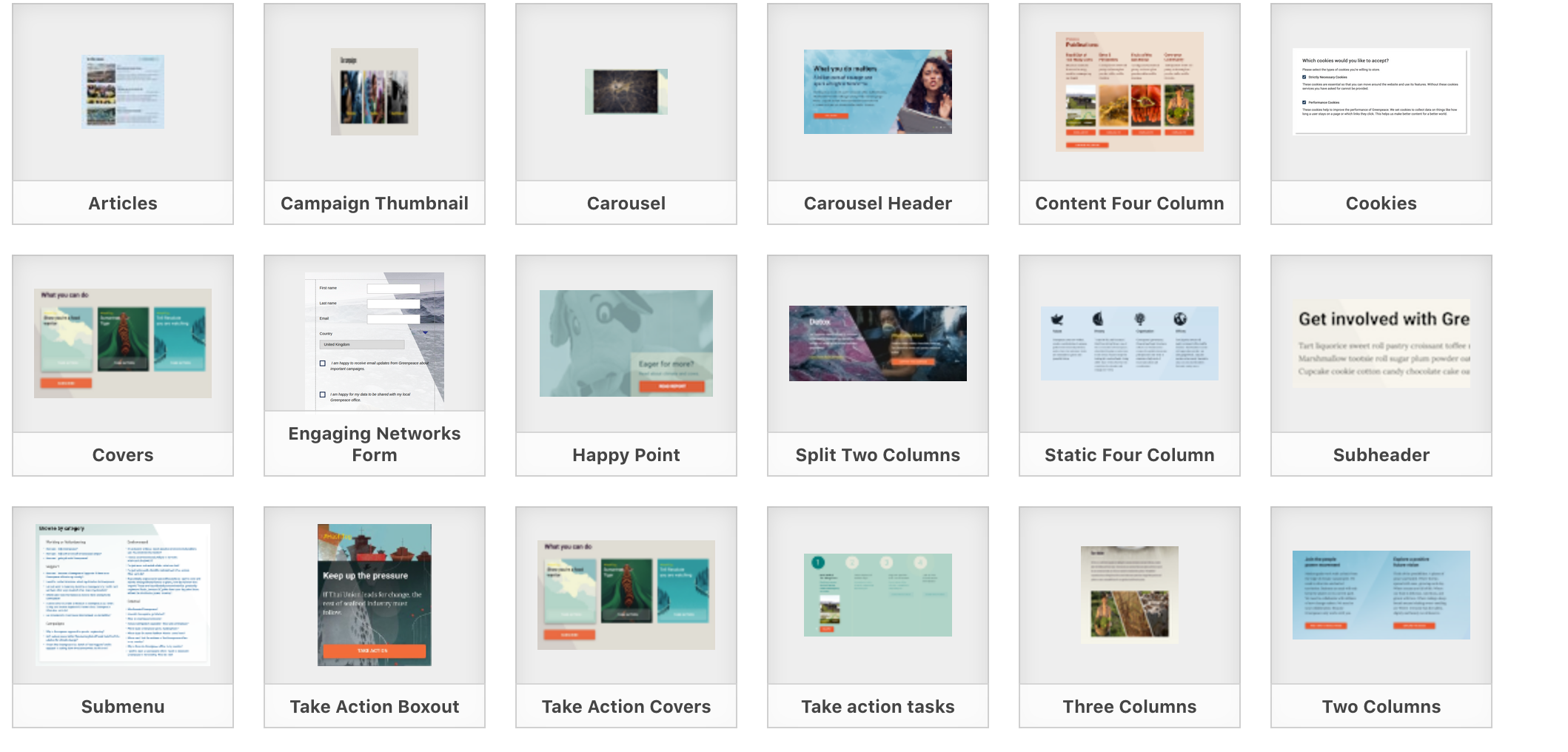
As we improve design the screenshots in the backend become outdated. We should replace them with icons (like in the backend block UX). We have all the icons, would just need to decide what the "overview" looks like since most of the blocks have multiple icons.
System Icons: https://drive.google.com/drive/folders/1al9JSopO3QbvtnPGSjuAu4R5zIbF9w21
Such a low priority, but I notice it all the time ![]()

