Original reporter: ktolen
Spreadsheet issue nr 70.
After analysis (Konstantinos)
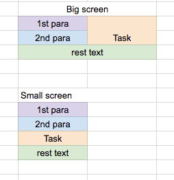
The problem is that the markup that was delivered by HM considered the 2 first paragraphs as something that would go to the left of the card (on big screens) or before the card (on smaller screens)
This is how it was imagined:

They did this, using bootstrap columns grid. But this implementation has the following problem: Columns must belong to a row. The only way they could have on the small screen 1st para, 2nds para, task and then rest text was by putting 1st para, 2nd para, and task in the same bootstrap row, in different columns
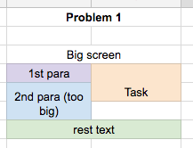
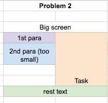
Now, their implementation creates problems in two cases, (one of which reported by Kelli)


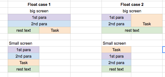
A solution (I don't know if it is the only one) would be to drop the bootstrap rows/columns grid, and treat the task as a floating element on the right side (like we would an image). In which case we can wrap things around it.
But: If we put the task to appear next to the first paragraph on the big screens, then it moves to the top on the smaller screens
If we put it to appear after 2nd para on small screens, then it appears bellow the first one on bigger screens.

Possible scenarios for now:
a) We leave it as it is, and we have the two problems on the top (if the 1st+2nd paragraph are big or small)
b) We drop bootstraping grid, and we use float, and we choose one of the two scenarios. Each one of these modifies the design (either of big screen, or of small screen). There may be a case that a front end developer may be able to deliver a solution that combines both (with a single markup that is), but I wasn't able to find it for now.
Dropping bootstraping grid means a bit more work to make things look again good.
- relates to
-
PLANET-1482 Post: reevaluate Take Action boxout
-
- CLOSED
-
-
PLANET-1676 Adjust Posts design on all viewports
-
- CLOSED
-
-
PLANET-1718 Frontend tweaks: Font-sizes + Spacing
-
- CLOSED
-
-
PLANET-1796 Post: Take action card functionality on mobile
-
- CLOSED
-